|
|
Post by Kirsui on Sept 9, 2014 21:37:24 GMT
You just gave me a few ideas of what other colours I need to add to my ref sheets. xP This looks very helpful too, should make colouring process a lot easier!  Speaking of colouring... I've been helping Zor with colouring character profiles for the comic. Thought I'd share this terrifyingly awesome work-in-progress of Zito. I swear, the eye colour he has makes him look insane with that expression. xD  |
|
|
|
Post by Leorgathar on Sept 9, 2014 22:03:01 GMT
Wow, you guys are working on a comic for this? I'm really, really impressed  I may not be taking part in this RP, but I look forward to see what comes out of that project ^^ |
|
|
|
Post by Zorayda on Sept 9, 2014 22:46:52 GMT
That looks great, Kir! I am so excited to get this going!
|
|
|
|
Post by Zorayda on Sept 17, 2014 17:20:53 GMT
Here's some sketches I did wooooo! Zorayda snarling 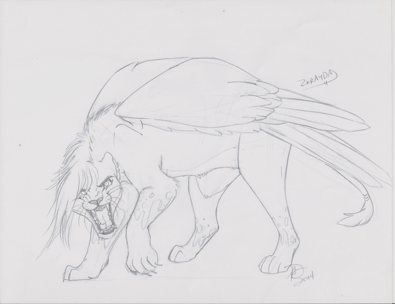 Zorayda flying 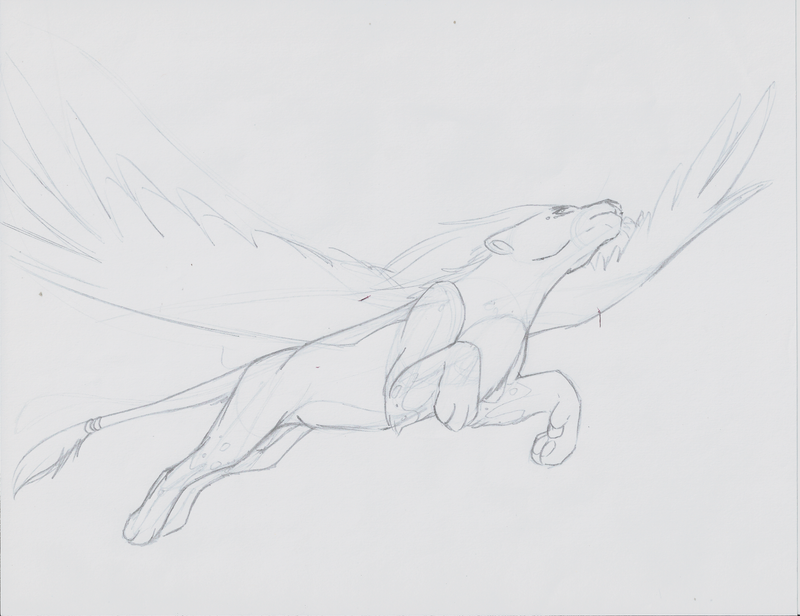 Fixed anatomy Anapa 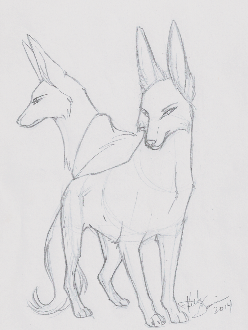 Haraka's shenanigans 1 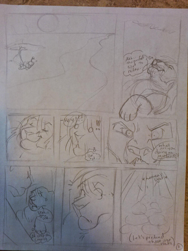 Haraka's shenanigans 2 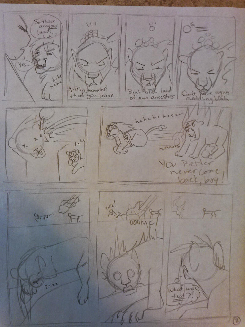 Moto alone 1 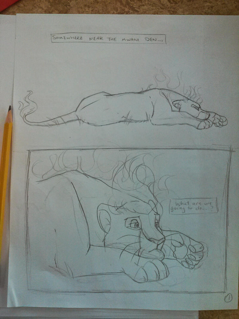 Moto alone 2 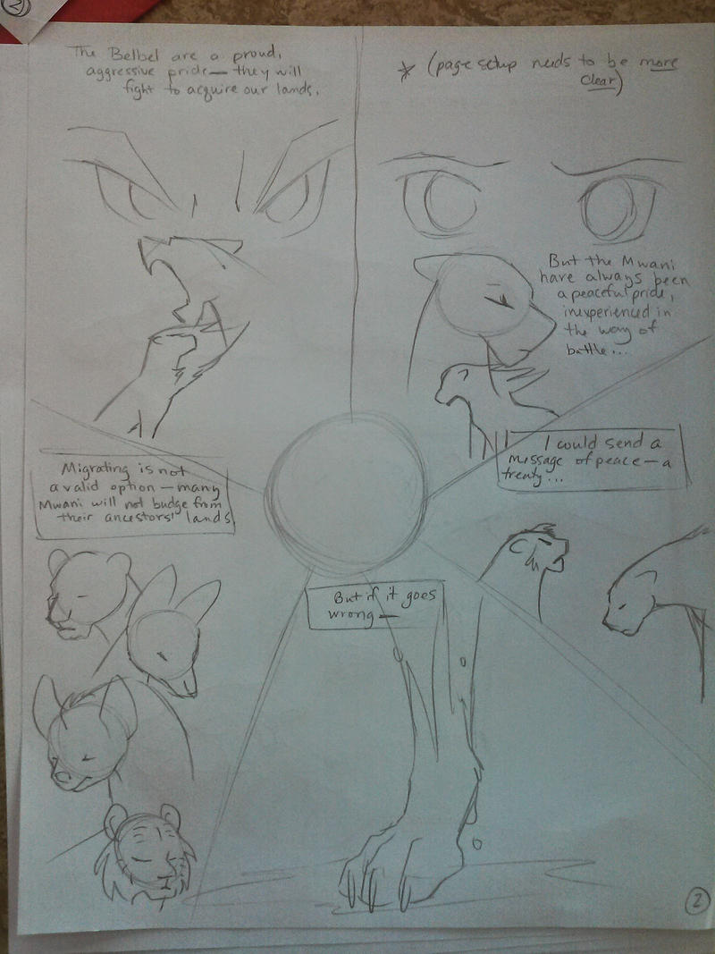 Moto alone 3 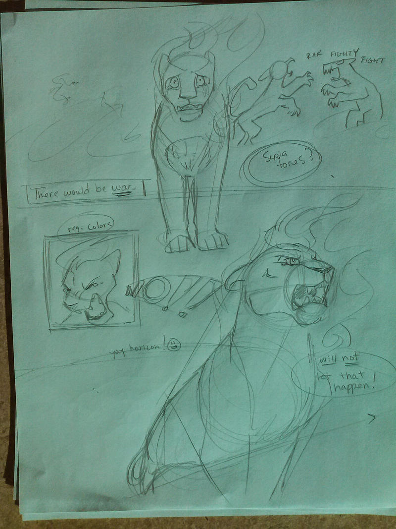 Sumai and Mlezi conversation 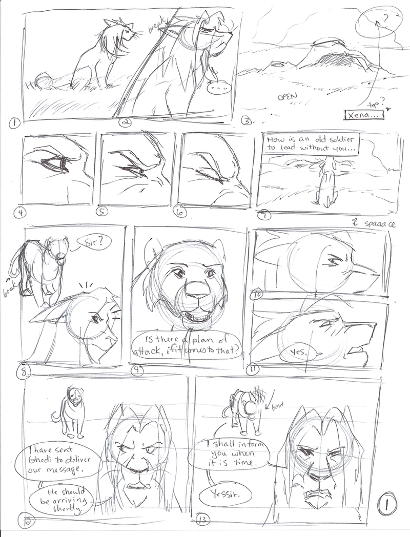 Zor and Ghedi delivering the message 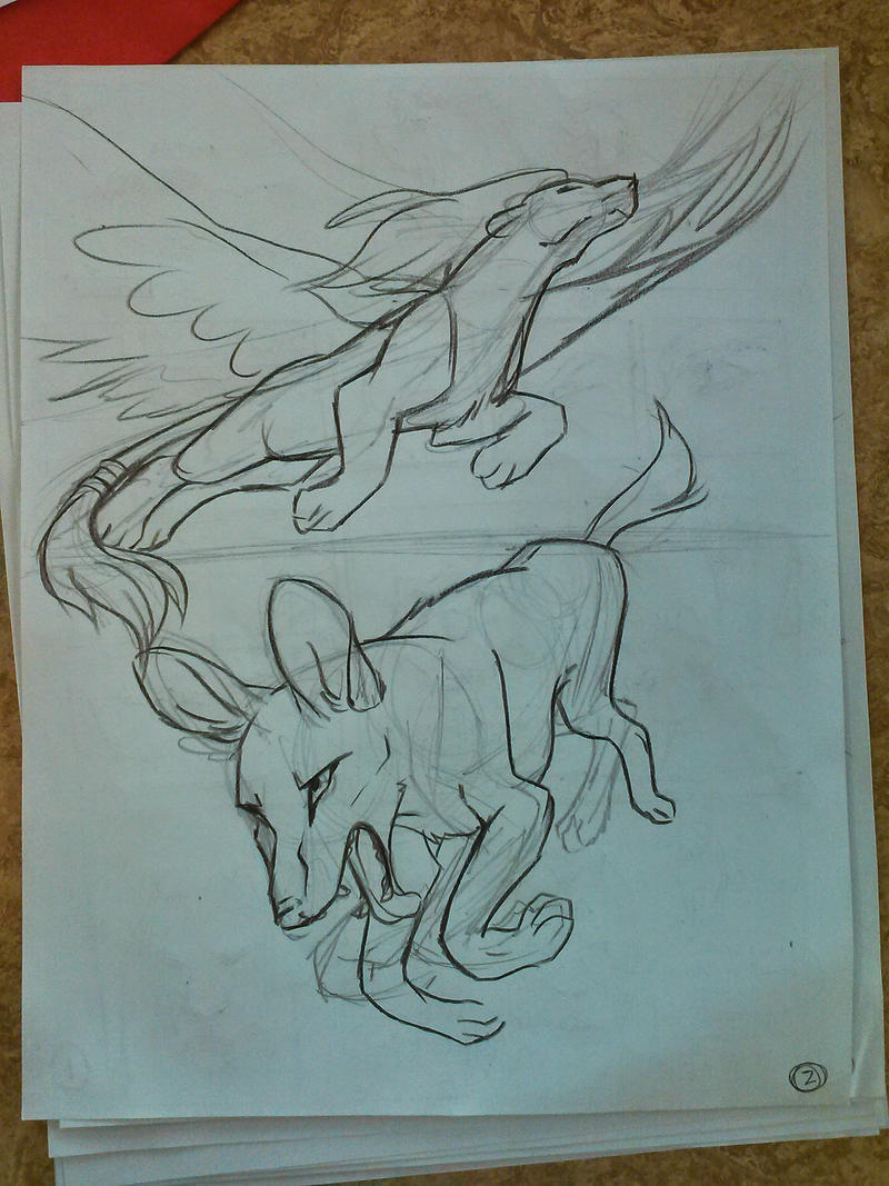 |
|
|
|
Post by Kirsui on Sept 17, 2014 18:38:42 GMT
Oh my gawd, Zorayda! THOSE LOOK FANTASTIC!  Askfhasda I need to look at them again just to write down all the things I wanted to point out.  Lets start with Angry Zorayda on the first sketch... That looks awesome!  I'm not used to seeing her with that expression but darn, she looks scary. And that mouth! A job well done there! C8 Anapa with fixed anatomy... I love how you've done her there!  The ears look great, as do her eyes and just everything. I approve wholeheartedly. :3 Haraka's shenanigans.... Just LMAO. XD The expressions are fantastic. xD In the first one I just love the 4th panel for some reason. xD I bet it's those eyes and that mouth that do it. XD And lol "heaven's light" hahahah, pure win there. XD And on the 2nd part his pose and expression on the 6th panel when he's running away... priceless. XD Moto looks great on the panels where he is lying down. It'll be interesting to see what his mane will look like when coloured, but I can tell you it's already looking nice as a sketch. :3 Great expressions on Sumai in the conversation between him and Mlezi. I think I might've told you before but I really like his eyes on panels 4-6. xP The expressions work great there I think. And lastly, interesting perspective choice for Ghedi and Zorayda delivering the messages. Not bad at all.  Zorayda looks nice when flying. Wings can be a pain to draw but so far she's looking great. :3 Keep up the good work!  |
|
|
|
Post by Zorayda on Sept 19, 2014 7:49:23 GMT
It's official... the title page has been finished. Ladies and gentlemen, here we go. 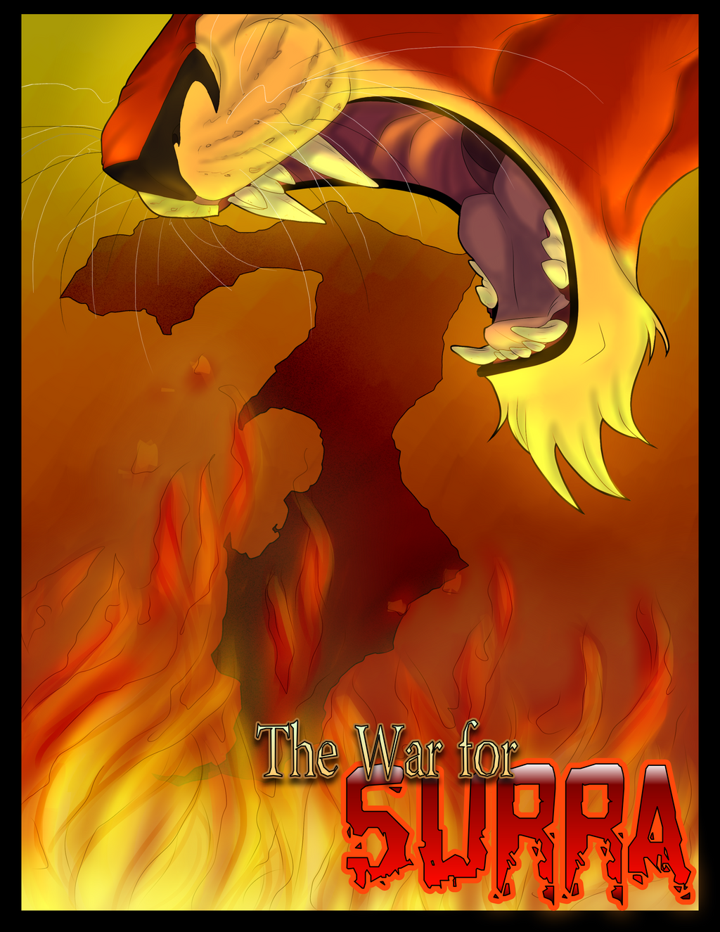 |
|
|
|
Post by Kirsui on Sept 19, 2014 8:57:56 GMT
Asdfkh that looks fantastic!! Love the style, and how you put how you put the map in the background. Sumai looks properly angry even though you can only see his mouth. x)
|
|
|
|
Post by Zorayda on Sept 26, 2014 7:28:41 GMT
Here's a little sneak peek of how I have been sketching out pages...  |
|
|
|
Post by Zorayda on Sept 29, 2014 2:26:06 GMT
So I was practicing speech bubbles in GIMP while on the phone with my sister, and this happened...   |
|
Akinai
Outlander
 Who's there?
Posts: 58 
|
Post by Akinai on Sept 29, 2014 3:08:06 GMT
So what you're trying to say is... your sister is a complete dork?
|
|
|
|
Post by Zorayda on Sept 29, 2014 6:00:43 GMT
No way, how'd you know?!
|
|
|
|
Post by Zorayda on Sept 29, 2014 18:43:13 GMT
Eh heh, sooooo, I'm really terrible at keeping up with the script >.>
I basically have a script in the images and speech balloons! So I was wondering... someone help please? ^^;;
|
|
|
|
Post by Kirsui on Sept 29, 2014 20:13:22 GMT
You only need to ask, Zor lol. xD I'd be happy to help you out if I can (other than colouring the character profiles). Just tell me what to do. xD As a suggestion, it might be a good idea to make thumbnails of each page. Having a written script helps, of course, but the thumbnails are what really give you a better idea of how to lay out each page so that the script flows smoothly. They also help you to keep track of where on the script you're currently at, as you can easily mark down on the thumbnails what you've already done and what comes next. Thumbnails are what I did with my little comic project, and though I haven't gotten around to actually drawing the pages I know the general layout much better now.   Those thumbnails only have the essential pieces of text written under them. The pages themselves have much more text on them. The comic was going to be the prologue to a story I've been writing for ages. (You can see the prologue *here* if you're interested, but do bear in mind it's very old and most likely full of spelling mistakes). Thumbnails is what I do with my Nuzlocke comic too. I have a VERY general plot script that consists of playthrough notes I jot down as I play. I later jot down more notes that give me the general idea of what should happen next in the story, and how I can transfer the notes taken while playing into a proper script (sometimes I do it even as I write the playthrough notes if I get an idea that I think might work in the story). Before I start the actual sketching I make thumbnails as preliminary sketches for each page (even though I later combine each individual page to a *longer part*). Obviously with the Surra comic you don't need to have anything like playthrough notes, though the general script you shared on google docs is somewhat similar. I'd suggest making the thumbnails next before doing any more full-sized pages, and then when you see what works and what doesn't in a general setting in the thumbnails you can mark the page starts and ends on the script notes. It's always useful to have the notes handy, and to keep yourself flexible if you notice something you thought would look good on the thumbnails doesn't turn out so great when you sketch the full page. .. Not sure if any of that helps, but it's just how I do comic planning.  Heck, I'm really bad at drawing comics as I tend to get easily distracted and frustrated when I have to focus on a full page (which is why my Nuzlocke updates, while looking good, take SUCH a long time to complete). And remember, Zor. You don't need to take on this huge project on your own.  I'd be more than happy to help you with colouration etc so you don't have to do absolutely everything. :3 |
|
|
|
Post by Zorayda on Sept 29, 2014 21:45:00 GMT
Thanks, Kir! I'll try the thumbnail method and see how that helps. It's just that... well, script writing is soooo boring XD So y'all may just have to deal with visuals only unless someone wants to be awesome and help with the text version of the script. But for now, the thumbnails seem a great idea to make page and panel variation, as well as pacing etc. for more intimate conversations versus action-packed battle sequences!
For coloration of splash pages and stuff, I realllllly like your shading and coloring! But for the comic pages themselves... well, I sort of like that 'cut-out' shading style of cell shading, if you know what I mean. It's much, much faster and easier to do, and looks sharper/clearer overall on a page. Soft cell shading wouldn't be bad, either, but the crisp lines might be better to define fur and give it that 'comic style' look.
The problem I have with the script writing is timeline placement and how to interpret people's posts so they convey the same message in both the comic and the roleplay. I also want to make absolutely sure that characters get their time in the spotlight (even if they aren't the main focus of every chapter).
I'm also a scatter-brained, disorganized sort of person, so getting this all together and figuring out what to ask help with is really hard for me, haha. So perhaps a screen-sharing/Skype call session would be called for with someone to get them up to speed with what I'm doing, ideas I have, and things I want to organize. I think that would be the best option.
|
|
|
|
Post by Kirsui on Sept 29, 2014 21:59:49 GMT
Heheh, I know my regular shading is a bit too complicated for comics. xD That's one thing I'm trying to work on in the Nuzlocke: a simpler shading style that suits comic-ing. My cell-shading sucks though (especially if you add in gradients), and I'm kind of lazy when it comes to learning how to properly do it. xD But I am trying to learn, whenever I have time to continue on the Nuzlocke, at least. xD However, as I said on the quick Skype convo, I can help with blocking flat colours for characters, and the occasional backgrounds if you need help with those. :3 It'd ease off the massive amount of work you'd otherwise have to do all on your own. xD Actually, now that I think about it, I really should try doing a few lion drawings with simple shading instead of the usual blended style I use. It's been pretty quick and easy in the Nuzlocke so far, and I really want to learn how to do fur in that shading style hmm.... Might have to look into it during the weekend. xDAnd yeah, a Skype call sounds good, and as I said in Skype a moment ago, I'm free during the weekend. xP I need to go sleep somewhat early on Sunday evening but that won't stop me from staying up on Friday and Saturday. :3 EDIT: I was gonna add in something about thumbnailing and script writing but I forgot what it was. I need to head to bed anyway, so I'll add that in later when I'm not as tired and can focus better on what I'm saying. xD |
|
|
|
Post by Zorayda on Sept 29, 2014 23:00:16 GMT
Well, I have pretty much all of chapter 1 laid out in my head... and I have the panels created in Comic Life 3. So I'll go with what I have and make quick sketches of it all (no more than a few minutes each page) and look at it all in thumbnail view, and make sure it's all exactly as I want it to be :3 If not, I'll tweak it here and there, but for now, unless people have objections to what I put up, I'm happy with what's there. EDIT: And flats would be much appreciated ;w; Though for Moto's mane, glowing spells, etc, I recommend using a midtone color of what the end result will be. For example, fire is red, yellow, orange, and white, so a bright orange would be ideal to flat color it. For blue magic, a mid-to-bright blue would work best. You get the gist  For backgrounds... I'm actually pretty good if I work at it. I just... have to work at it >.> We'll collaborate and stuff on this in the Skype chat, though. By the way, you're eleven hours ahead of me :'D So if I hop on when I wake up, it should be late afternoon/evening/night (depending on my laziness) for you. |
|
|
|
Post by Kirsui on Sept 30, 2014 5:35:44 GMT
Yep, I perfectly got that with the fire colours. xP I do it too when I colour fire. I tend to use the shade of Kirsui's eyes for hers, so if that works with you I'll go with it. xP
And yeah, I'll make a mental note of your timezone. xD I thought it would be late for me anyway, but that doesn't matter since I tend to stay up later during weekends anyway now that I got my sleeping pattern back in order. xP
|
|
|
|
Post by Kirsui on Oct 5, 2014 14:01:53 GMT
So as I mentioned some weeks ago, I've been colouring profiles for the Surra comic. xP Zorayda did an awesome work with the lineart and it's been a pleasure colouring them.  Here's all three that I've done so far. :3 I've already sent the original larger files to Zorayda, but I thought I'd show you others what they look like. xP    On that note, I need to update Zito's reference sheet since I changed his markings slightly. Actually come to think of it, I need to update all of my characters' sheets to include the missing colours (such as insides of mouth etc). Oh well. xD |
|
|
|
Post by Zorayda on Oct 5, 2014 21:42:41 GMT
Yayyy! These are gorgeous, Kir  Thanks again for all your work on these :3 They've turned out beautifully  |
|
|
|
Post by Kirsui on Oct 6, 2014 21:44:56 GMT
Heheh, no problem.  Just send me more when you've gotten the line arts done and I'll slap some colours on.  AND here we have Mlezi!   |
|
|
|
Post by Mercy on Feb 4, 2015 1:17:26 GMT
*Wants to be able to do great things like Zor and Kir* Just wanted to pop in and say that this is stupendous work! I'm really very impressed by both of you guys' (<-grammar? your?) hard work and dedication! I look forward to seeing more.  Also, Christmas isn't that far away..if anyone wants to get me a new art tablet...yeah..  |
|
|
|
Post by KanuTGL on Feb 5, 2015 15:37:21 GMT
Dang, here's a bunch of stuff I missed  Those "profile shots" are all looking soo cool  Amazing work, both of you! |
|
|
|
Post by Zorayda on Jun 15, 2015 21:58:24 GMT
I call this piece... "The Tears that Started a War". :3  |
|
|
|
Post by Leorgathar on Jun 16, 2015 1:17:43 GMT
Amazing expressions, Zor. Awesome work!  |
|
|
|
Post by mane6 on Jun 16, 2015 16:26:22 GMT
Oh my gash I really need to get back into this roleplay. *0*
I just scrolled through all the art and its beautiful!
|
|
|
|
Post by Zorayda on Jul 5, 2015 19:06:17 GMT
Made a private Imgur album for you guys to bookmark and check out when I update! I may or may not be working on something today...  Though my style has drastically changed o.o imgur.com/a/AjzR3#0 |
|
|
|
Post by Zorayda on Jul 7, 2015 23:27:43 GMT
Here's a taste of the next page :3  |
|
|
|
Post by Leorgathar on Jul 8, 2015 6:03:41 GMT
Oooh that looks really good  |
|
|
|
Post by Kirsui on Jul 8, 2015 9:06:47 GMT
Oh wow, Zor, that looks epic!  Loving dat anatomy on the bottom panel's sketches, by the way. Very nice.  |
|

